
Assignment #1 icons
I created icons for rain, a flower shop, and ice cream. I think I could have changed my rain icon to make it better in some way, along with my flower shop. I think i did well with the ice cream icon, and over all I'm happy with what I have done. I could always improve but this was a start in working with all of the shapes tools.

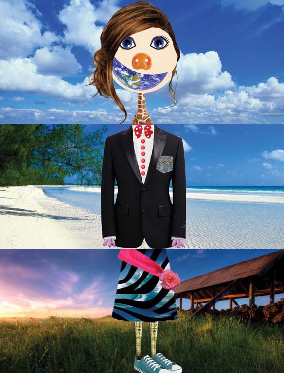
Assignment #2 Texture Grid
The objective of the assignment was to learn to use the pen tool and to learn about texture, space, and value. Each row is one of these things. I chose patterns that I thought fit each category. These patterns vary in complexity and color but all help make up the texture grid.

The main purpose of this design was to focus on color and the color wheel. I was also to come up with two matching objects that worked well together in the design.

The idea behind this design was a self portrait.We had to create four different color schemes to use on the same picture. We also had to move and focus the picture differently to add interest to the design.

This design is a collage. I used smaller pictures of clownish blended together to overlay on the larger image.

Assignment #6
The purpose of this assignment was to learn how to cut out elements in photoshop by using the mask function. I created a picture that ended the sentence "If I could cross the road.....". The design incorporates different objects that would not normally be used as they are.

Assignment #7
The purpose of this assignment was to cut yourself out of a photo and insert yourself into a different photo. The photo I put myself in was of the Goo Goo Dolls, my favorite band. I used the layers mask in Photoshop to hide the rest of the back round behind me so it would look like I was really in the photo.

Assignment #8
For this assignment we were supposed to find an image that had meaning and create it out of type. The photo I found was of a dove taking flight. I thought the way the doves wings were up and out really captured the movement in the bird. I feel I translated the image into type fairly well, but I think wing made out of larger letters looks too heavy. Besides that, I wouldn't change a thing.

The purpose of this assignment was to use text and the principles of design together. The text was supposed to be organized in unique ways that represented the principal given. I feel I could have done better on some squares and worse on others, but overall I am happy with my design.

Assignment #11
This assignment was about combining text with a photograph. The photograph had to be taken by me and it was a photo I had taken last summer when I was out west, which is why there are canyons. The words in the background are the lyrics to the owl city song "to the sky" repeated. I had to use the different effects in photoshop to blend and harmonize the image the way it is. I think I was able to combine the different elements well and am proud of the end result.

Assignment #12
This assignment was about creating an alphabet out of everyday objects u see every day. I think i was able to complete the assignment and show many different views on everyday letters. Most of the letters came from things in and around my house.
Assignment #13
The purpose of this assignment was to create an exquisite corpse. We worked in groups of three or four and we each had a part of the body to create without seeing anyone else's part. My part was the legs and i feel i was able to accurately capture the randomness of what exquisite corpse is about. I think that now seeing the other parts maybe i could have chosen a background that did not have a sky but that is my only regret with assignment.

Assignment #14
The purpose of this assignment was to create a poster for the organization AIGA. Others created posters for various organizations and jobs. I chose to not do anything in the poster that directly related to the organization but rather to design itself. In the poster I was supposed to include the Z eye movement. I felt i accomplished this and the message of the organization fairly well. In my design i wanted to show what you could do with design and graphic design in particular.

The purpose of this assignment was to create an illuminated manuscript. I tried to include all of the elements you would see on an illuminated manuscript (ie the border and larger, decorative first letter). We used the lyrics from a song for the words. I chose the song "You Belong With Me" by Taylor Swift because it is one of my favorite songs. I used roses and green leaves because i thought it fit with the theme of love that is in the song.

This assignment was about creating a timeline for the history of visual communications. I tried to use bright colors with their complements to liven up the subject. I wanted it to look like talk bubbles for where the words were. All the information came from podcasts.

For this assignment we had to create a logo and there were a few options for the company but i chose spin records. I tried to tie in the words with the record by making the dot on the i the middle dot of the record. We could only use two colors and i chose black and orange because orange is a popular color at the moment and with black it really pops.

The purpose of this assignment was to create a logo with minimal pictures and mostly focused on the words. I chose Mimi's Flower Shoppe and I tried to use popular colors that worked together. I think the logo on the top right corner is the best because it is very swirly and cursive but still fun with the flowers.


Assignment #19
For this assignment we had to create a stationary package including a self designed logo for one of three different companies. I chose Azul Salon & Spa and I tried to use shades of blue because it is the color of water. It is also a soothing color and that is exactly what a spa is meant to do, sooth.

Assignment #20
This is our final assignment for this year and the purpose was to create a poster about a social issue. I chose child abuse because it is an interesting and relevant to todays going ons subject. My logo was a big hand holing a little hand to somewhat symbolize that adults should care bond and unite in friendship and love with children instead of hurting them. The child is no one particularly famous or well known, i just chose her because she had a sad look that echoed even through a picture.